MARKETING DESIGN
Marketing materials are still relevant, even in today's digital world. The physical act of handing something to someone tells the recipient "I have something special I want you to see." And what is more special than what your business has to offer them?! Plus, with in-person meetings still a little difficult, these can be mailed to your clients as well.
Here are projects I have created that can be some good inspiration for you. This grouping includes basically anything that can be printed; ie: Business Cards, Flyers, Postcards, Trifold Brochures, Catalogs, Signage and Handouts. Click into each project to see the progression of its creation…
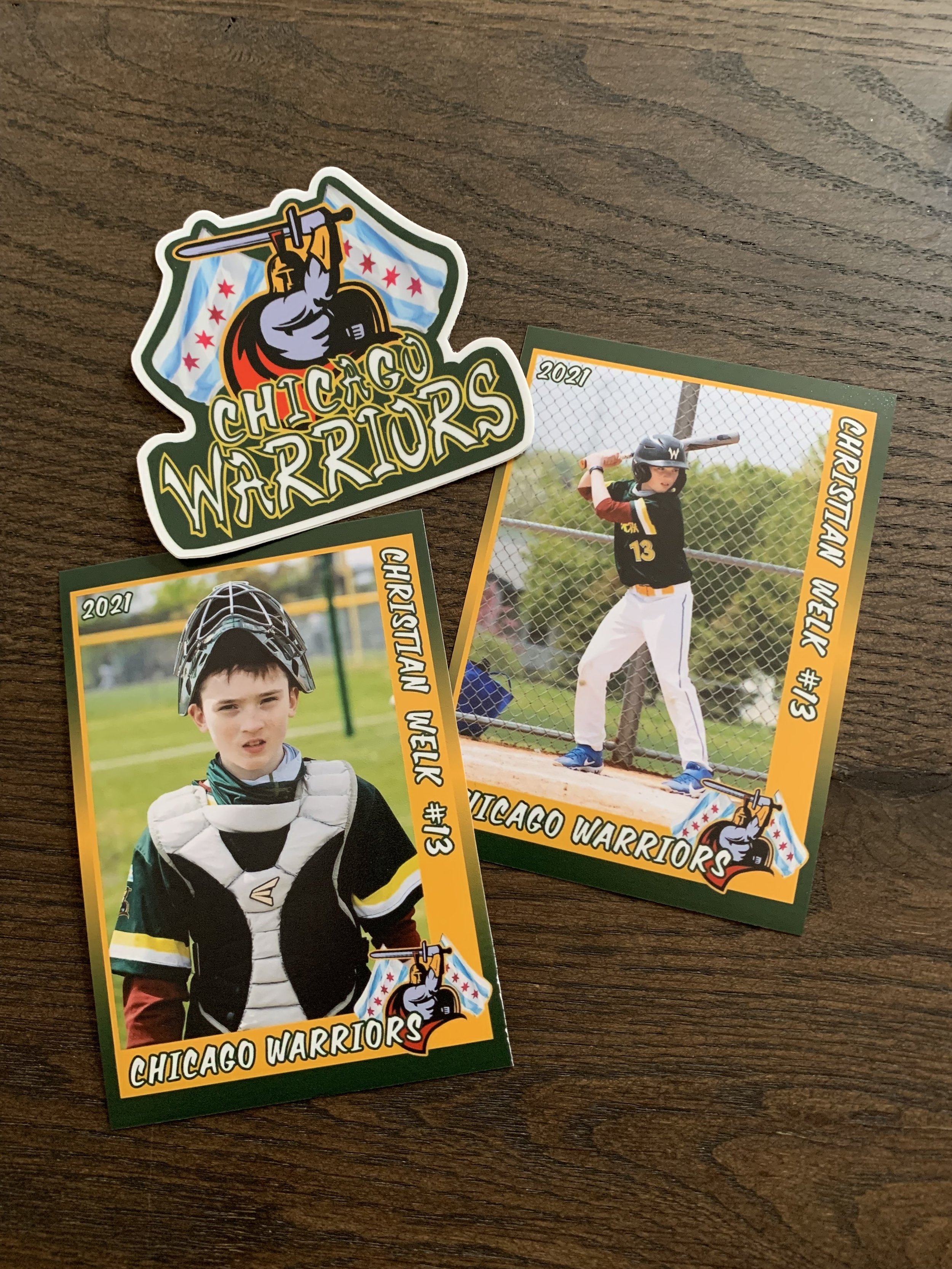
SWAG DESIGN: Chicago Warriors
In honor of my son's baseball season starting later this month, I want to show you some fun swag I had made for the team in 2021 for their tournament in Cooperstown, NY! Click to see all the fun things we made!
CATALOG DESIGN: Carolina Pet Company
As a wholesaler, it is vital to show your retail customers the scope of your collection. And even though you have a spectacular website, sometimes nothing beats showing all of your products laid out in a catalog. Click to read more about this catalog design I created for Carolina Pet Company…
Print’s NOT Dead ☠️
I am a firm believer that Print's NOT Dead! ☠️
Not because I want to sell my services (though, if you need some printed (or digital) materials designed, hit me up!) but because I think people still like holding and interacting with a physical item in their hand. Plus, the physical act of handing something to someone tells the recipient "I have something special I want you to see." And what is more special than what your business has to offer them?!
HANDOUT DESIGN: Chicago Textile Corporation
When you have a business that has a lot to offer, it can be difficult to include it all into a single handout without your message getting lost in all of the noise. Click to read more about how I accomplished this for the Chicago Textile Corporation and their vast assortment of home furnishings…
EVENT DESIGN: Art Show Print Marketing
Sometimes to get the word out about an event, nothing beats an old school handout. In January 2022, I was asked to create a series of print materials to generate awareness for a local Art Show in Chicago. Click to read about what we created…
TRI-FOLD DESIGN: Carolina Pet Company
Printed marketing materials are a must even in today's digital world. The physical act of handing something to someone tells the recipient "I have something special I want you to see." And what is more special than what your business has to offer them?! Check out this printed piece I created for The Carolina Pet Company…
CATALOG DESIGN: Howard Elliott Market Collection
When you sell products, nothing beats having them expertly displayed in a catalog to hand out to your customers. As a buyer, there is just something about holding the book in your hand, flipping through the pages and having the ability to make notes on the pages. And even though many things have gone digital, nothing beats having a physical object to interact with. As the resident graphic designer for The Howard Elliott Collection, it was up to me to create this catalog experience for our customers. Read on to see how these catalogs were created…
POSTER DESIGN: Chicago Poster
The Chicago Graphic Design Club posted a project to create a poster illustrating what Chicago means to you. Even though I was not born in Chicago, I have lived here for 25+ years and consider myself a native. The city is in my blood, and now that I am here, I don’t think I will ever leave. This project made me think why this is. Read on to see the progression of this design…
BUSINESS CARD DESIGN: Colour:fix Art
Colour:fix Art harnesses his passion for color into beautiful, original paintings. He wanted his business cards to be all about the science of Colour: Colour theory. See the progression of this design here…
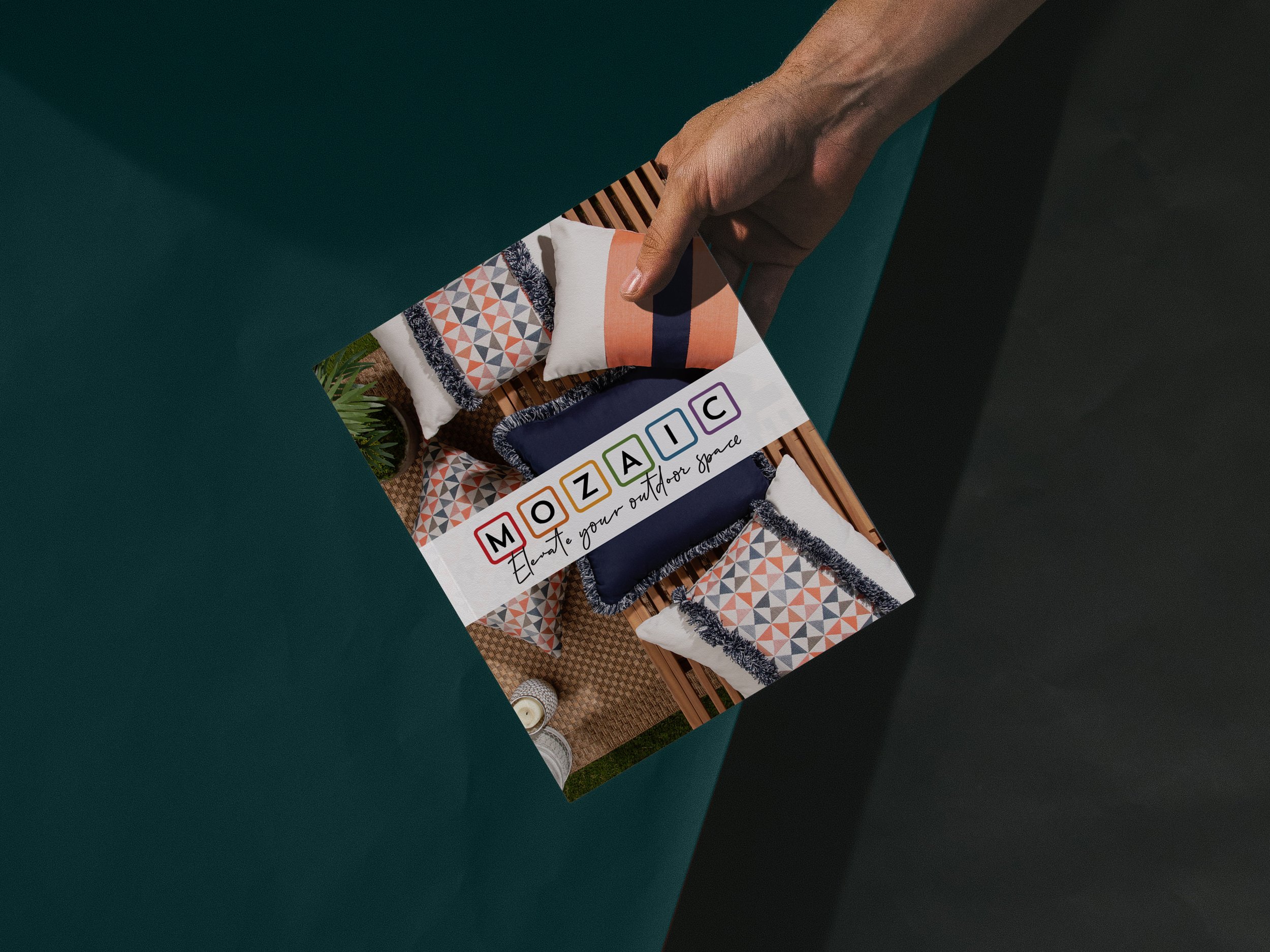
BROCHURE DESIGN: MOZAIC
Even though many presentations have gone digital, there is something to be said about holding a printed brochure in your hand and flipping through the pages. This is the feeling my client, MOZAIC, wanted to capture in their latest brochure…
Like what you see?
These are print designs I have created for other companies. Want to see what we can create together to make your small business stand out? Click below and let’s start a conversation 👇


