LOGO DESIGN: Colour:fix Art
"If colour is your addiction, then we are your fix." This is the slogan of Chicago based artist, Colour:fix Art
Painting is something that has been a long time hobby and passion of Michael Bever, the artist behind Colour:fix Art. But now, it is his profession as well and he needed the basics: logo & business cards.
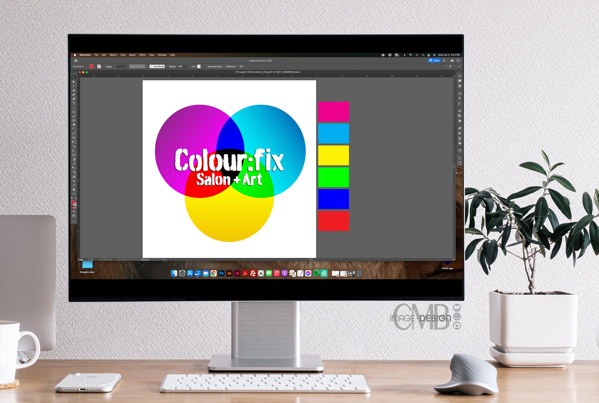
You might think that an artist just paints a pretty picture, but you wouldn't believe the amount of color theory, techniques and science he applies to every work. Therefore, Michael wanted the logo to portray the science of color by incorporating the color wheel, not with red, blue and yellow. But Magenta, Cyan and Yellow.
The artist knew what he wanted, and it was up to me to take it to the next level. I created the overlapping circles, and added a slight gradient to each to give the colors some depth. Then, I added a spray painted-esque type in white to look like the wording was painted on.
Colour:fix Logo designed by CMB Image + Design
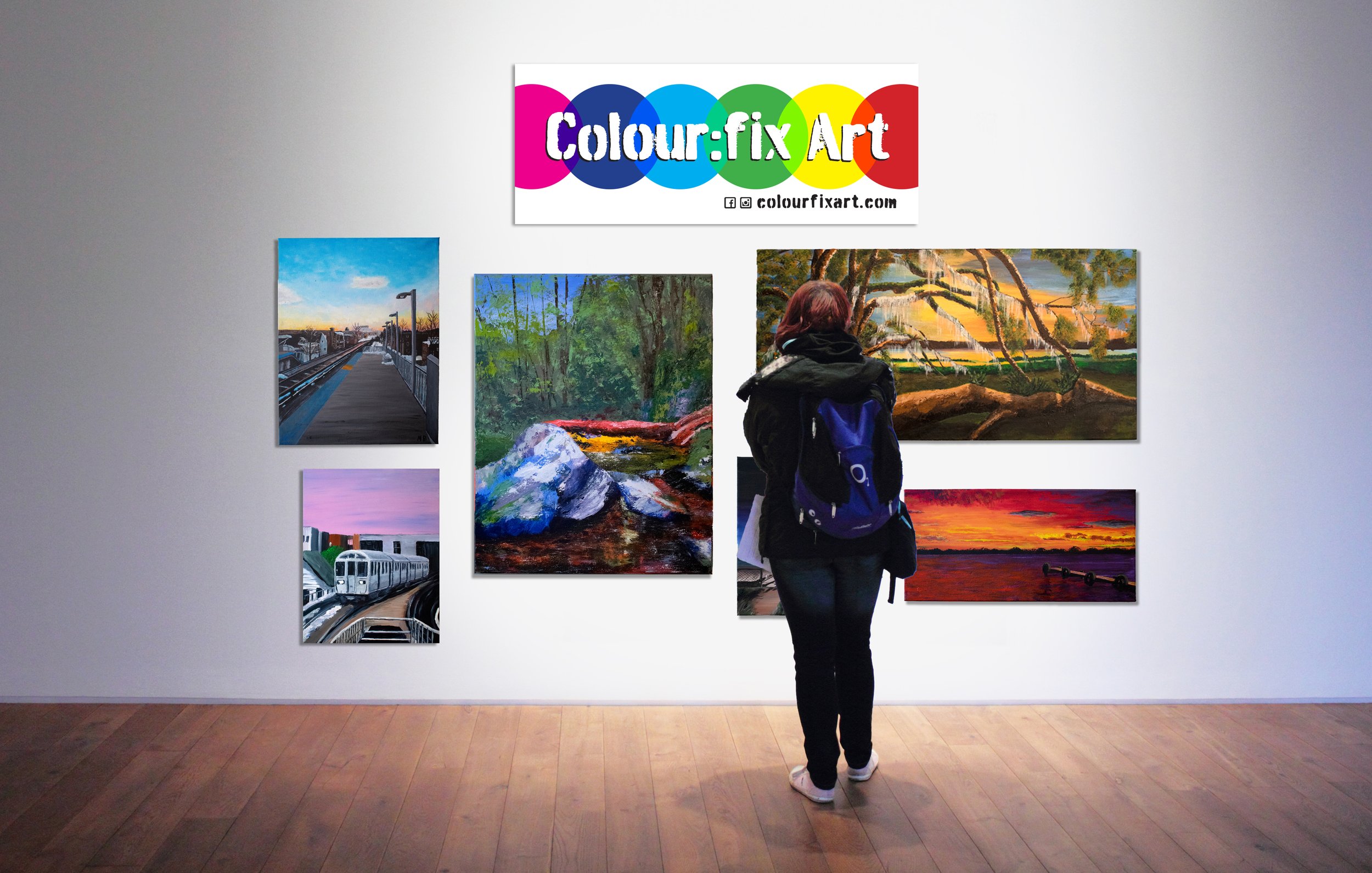
The round color wheel logo works great for square applications, however it wasn’t working out for horizontal formats. I felt we needed to do something different to grab attention and use up the space. Since I needed something linear, I took the wheel and made it linear! The overlapping circles create a line and I added the spray painted text to the top. This format works perfectly for his Business Cards and Signage (both of which I created 😁)
Colour:fix sign designed by CMB Image + Design
You can see the Colour:fix logo out in the wild on their website: www.colourfixart.com. Here you can get your fix of colour with all of his art both on hair and canvas!
Love to hear what you think about this design. Tell me in the comments below 👇.
Now that you’ve seen what I’ve created for this client, what can we create together? Contact me today and let’s talk!


